Margot + Adam’s Scottish Wedding at Rhinegeist
I only had the pleasure of meeting with the bride, Margot, once, but she put total faith in her mom, Beth and wedding planner, Viva Bella Events. Designing the stationery was so stream-lined. Beth knew exactly what she wanted and was very focused on quality. Typically we review the umbrella look of the wedding - the colors, the florals, the formality - but in this case, Beth wanted something that was clean, simple and felt amazing.
THE STATIONERY
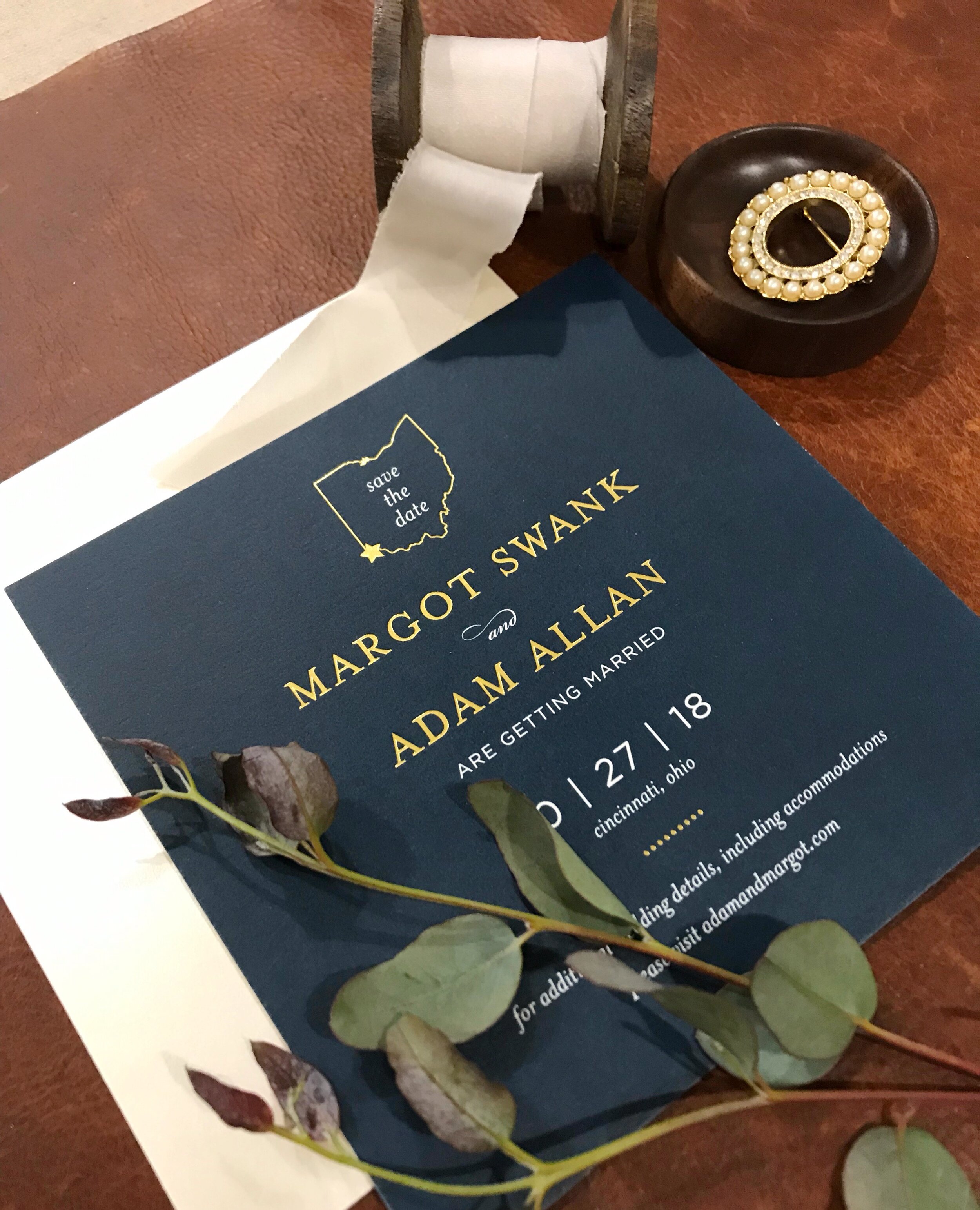
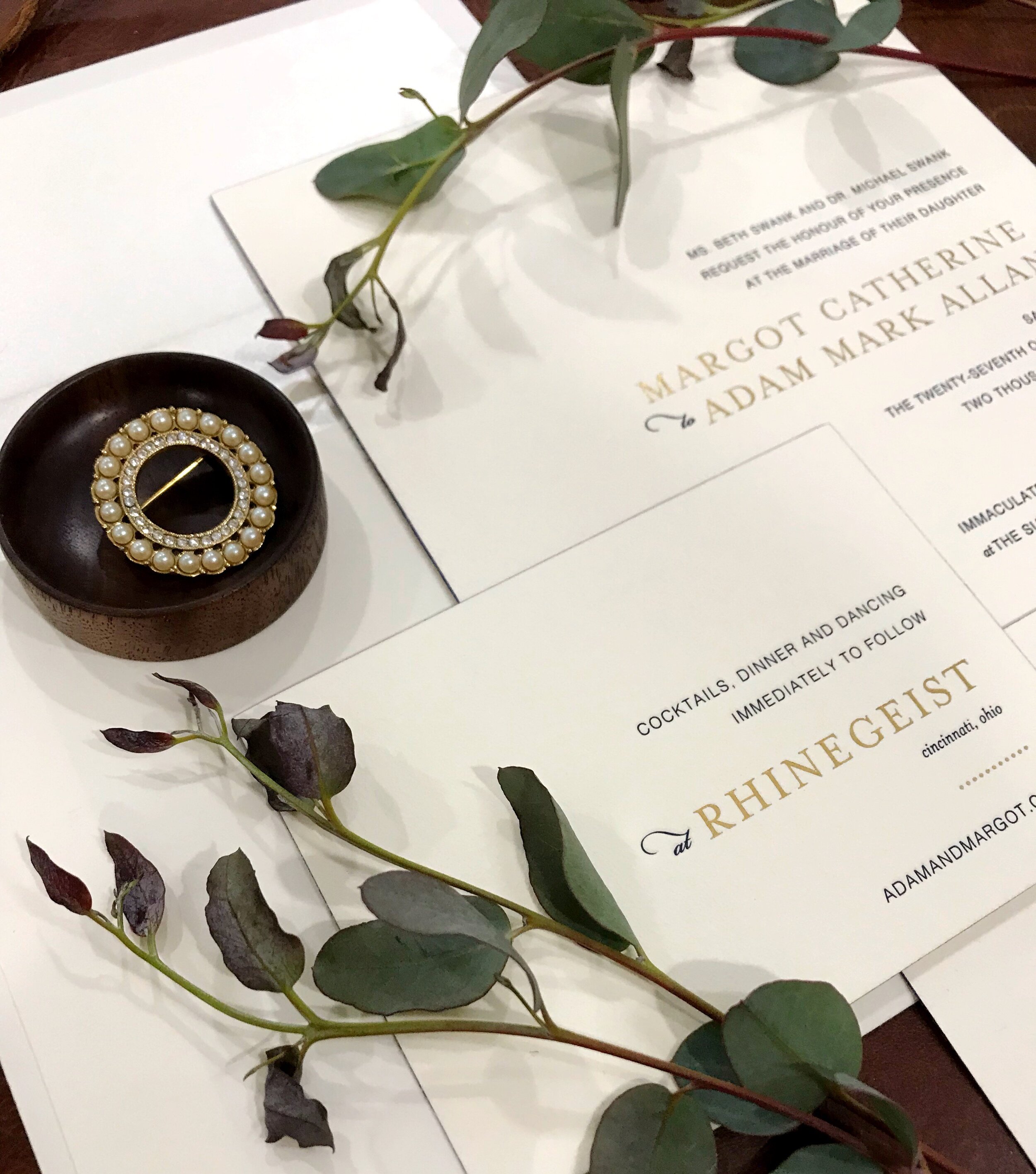
The first talking point was the materials we were going to use. The thickness of the stock and the texture, were very important. Beth loved the idea of something that felt like cotton, but wanted to make sure it had some weight and did not curl. We decided to duplex the stock and in order to emphasize the soft tooth of the surface, we went with a combination of navy letterpress and gold foil-stamping.
Both print processes actually “push” or “deboss” the image into the paper using ink (letterpress) or foil. To add just a little extra pop of interest and zing - edge-foiling in a brighter cobalt blue. Edge-foil works perfectly on a nice, thick stock, and is a great way to add some visual appeal without pulling focus from the text on the face of the invitation.
Clean & Simple
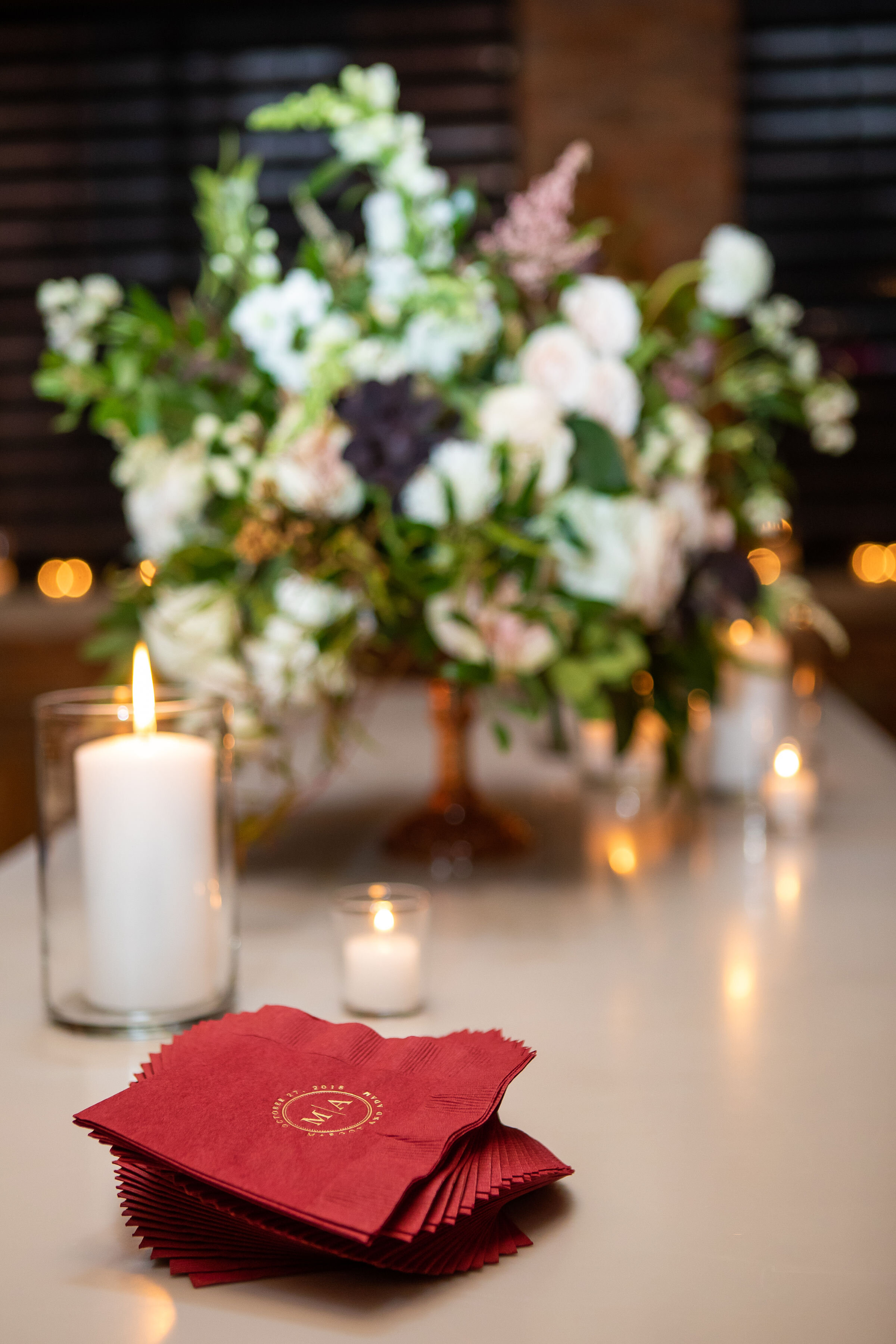
Even the monogram was simple, and worked beautifully from start to finish - on the printed items, as a lighting projection, and for use on informal stationery for both the bride and groom to use in the future.
So with all of this focus on how the materials felt and played with the print, the rest of the direction was simple - keep it clean, keep it neutral and keep it legible. The simplicity of all three together kept the ensemble from being busy or distracting and truly a tactile-driven piece.
THE MONOGRAM
Even the monogram was simple, and worked beautifully from start to finish - on the printed items, as a lighting projection, and for use on informal stationery for both the bride and groom to use in the future.
This is a piece that will be showcased in our studio for years to come. It is such a great example of how impactful lots of blank, negative space, something delicate to the touch, and being easy on the eyes, can all work together and just scream - this is spectacular (but quietly, more like a stage whisper, of course!)
CREATIVE PARTNERS
Photography: David Stephen Photography | Venue: Rhinegeist | Florals: Yellow Canary | Planning: Viva Bella Events
